Ant Design Blazor is a component library for the Blazor framework. It provides many components. Today, let’s take a look at Ant Blazor Modal Dialog. First, create a new Blazor project. Or you can add Ant Blazor to your existing Blazor project. I have written an article about how to add Ant Blazor to the Blazor project. If you don’t know how to add Ant Blazor to your Blazor project, You can read it from this link
In Ant Blazor there are 4 main ways to create Modal.
Using Modal Service
Using Confirm Service
Using Modal Component
Using Template And Modal Service
In this article, let’s see how to create a modal using Modal Service and Confirm Service.
Create A Modal Using Modal Service
First, inject Ant Blazor modal service into your razor component.
@inject ModalService _modalService;
Modal service provides different ways to create different modal dialogs according to their content. All of these methods take a ConfirmOptions object as an argument. For example
ModalService.SuccessModalService.ErrorModalService.WarningModalService.ConfirmModalService.ConfirmAsyncModalService.InfoAsyncModalService.SuccessAsyncModalService.ErrorAsyncModalService.WarningAsync
All of the above methods create a modal that contains only a single button except Confirm and ConfirmAsync methods. These two methods create a modal containing two buttons. The first button is the Ok button and the second one is the Cancel button.
Ok button click -> returns true
Cancel button click -> returns false
Other modals’ button click will return true
All of the above methods take a ConfirmOptions object as an argument. For example, see below code
var options = new ConfirmOptions
{
    Title = "Delete Confirm",
    OkText = "Delete",
    Content = "Do you want to delete this item?",
    Centered = true,
    Icon = @<Icon Type="exclamation-circle" Theme="outline"/>,
    Button1Props =
    {
        Danger = true,
        Shape = ButtonShape.Round,
        Icon = "delete",
    },
    Button2Props =
    {
        Shape = ButtonShape.Round,
        Icon = "close"
    }
};

var result = await _modalService.ConfirmAsync(options);
if (result)
{
    Console.WriteLine("Ok");
}
else
{
    Console.WriteLine("Cancel");
}
This code will show a modal like this.

ConfirmOptions class contains many attributes that describe your modal behavior.
CancelText | Text of the Cancel button, equivalent to Button2Props.ChildContent | string|RenderFragment | Cancel |
Centered | Centered Modal | bool | FALSE |
ClassName | className of container | string | - |
Content | Content | string|RenderFragment | - |
Icon | custom icon | RenderFragment | - |
Keyboard | Whether support press esc to close | bool | TRUE |
Mask | Whether show mask or not. | bool | TRUE |
MaskClosable | Whether to close the modal dialog when the mask (area outside the modal) is clicked | bool | FALSE |
OkText | Text of the OK button, equivalent to Button1Props.ChildContent | string | OK |
OkType | Button type of the OK button, equivalent to Button1Props.Type | string | primary |
OkButtonProps | The ok button props , equivalent to Button1Props | ButtonProps | - |
CancelButtonProps | The cancel button props, equivalent to Button2Props | ButtonProps | - |
Title | The modal dialog's title, If the TitleTemplate is not null, the TitleTemplate takes precedence | string | null |
TitleTemplate | The modal dialog's title | RenderFragment | null |
Width | Width of the modal dialog | string|double | 416 |
ZIndex | The z-index of the Modal | int | 1000 |
OnCancel | Specify a function that will be called when the user clicks the Cancel button. The parameter of this function is a function whose execution should include closing the dialog. You can also just return a promise and when the promise is resolved, the modal dialog will also be closed. It's only trigger in Confirm created by ModalService mode | EventCallback? | null |
OnOk | Specify a function that will be called when the user clicks the OK button. The parameter of this function is a function whose execution should include closing the dialog. You can also just return a promise and when the promise is resolved, the modal dialog will also be closed. It's only trigger in Confirm created by ModalService mode | EventCallback? | null |
Button1Props | the props of the leftmost button in LTR layout | ButtonProps | Type = ButtonType.Primary, ChildContent is in the same order as ConfirmButtons |
Button2Props | the props of the second button on the left is in the LTR layout | ButtonProps | ChildContent is in the same order as ConfirmButtons |
Button3Props | the props of the rightmost button in LTR layout | ButtonProps | ChildContent is in the same order as ConfirmButtons |
Using ButtonProps you can customize your modal’s button properties. ButtonProps class contains these attributes
Property | Description | Type | Default |
Block | Display button as a block element | bool | FALSE |
Ghost | Button is hidden and outlined. Only display when curson hover | bool | FALSE |
Loading | Display loading spinner in the button | bool | FALSE |
Danger | Display a danger button (Red color button) | bool | FALSE |
Type | Button type | string | ButtonType.Default |
Shape | Button shape | string | null |
Size | Button size | string | AntSizeLDSType.Default |
Icon | Button icon | string | - |
Available Button Shapes:
ButtonShape.CircleOutlineModalService.Round
Available Button Sizes:
AntSizeLDSType.DefaultAntSizeLDSType.SmallAntSizeLDSType.Large
Available Button Types:
ButtonType.DefaultButtonType.PrimaryButtonType.DashedButtonType.Text
Create A Modal Using Confirm Service
IConfirmService.Showto show a simple Confirm dialog like MessageBox of Windows, it's different from ModalService. ModalService can only create OK-Cancel Confirm dialog and return ConfirmRef or OK button is clicked, but ConfirmService return ConfirmResult.
According to the above description mentioned in the Ant Design Blazor page, ConfirmService is different from the ModalService by the return value. If you want to provide 3 choices to the user within the modal, you have to use Confirm Service to create your modal.
First, you have to inject this into your component.
@inject ConfirmService _confirmService;
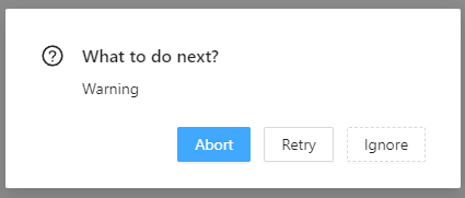
Let’s see an example code using ConfirmService
var buttonConfiguration = new ConfirmButtonOptions
{
    Button2Props = new ButtonProps
    {
        Danger = false
    },
    Button3Props = new ButtonProps
    {
        Type = ButtonType.Dashed
    }
};

var result = await _confirmService.Show(
    "Warning",                           // Modal Title    (Required)
    "What to do next?",                  // Modal Content  (Required)
    ConfirmButtons.AbortRetryIgnore,     // Button Configuration To Display
    ConfirmIcon.Question,                // Modal Icon
    buttonConfiguration,                 // Displaying Button's properties
    ConfirmAutoFocusButton.Ok            // Autofocus Button
);

if (result == ConfirmResult.Abort)
{
    Console.WriteLine("Abort");
}
else if (result == ConfirmResult.Retry)
{
    Console.WriteLine("Retry");
}
else
{
    Console.WriteLine("Ignore");
}
The above code creates a modal like this.

Modal title and modal content are required parameters. Others are optional. Button Configuration is about what buttons should be displayed in the modal. There are 6 options for that, They are,
ConfirmButtons.Ok (Ok Button Only)ConfirmButtons.OkCancel (Ok and Cancel Buttons)ConfirmButtons.YesNo (Yes and No Buttons)ConfirmButtons.RetryCancel (Retry and Cancel Buttons)ConfirmButtons.AbortRetryIgnore (Abort, Retry and Ignore Buttons)ConfirmButtons.YesNoCancel (Yes, No and Cancel Buttons)
There are 6 choices for ConfirmIcon. They are,
ConfirmIcon.NoneConfirmIcon.WarningConfirmIcon.ErrorConfirmIcon.SuccessConfirmIcon.Question
ConfirmButtonOptions contains 3 ButtonProps attributes for modal buttons. You can use these attributes to customize your buttons. The Autofocus option is to select what button should be auto-focused when the modal is opening. There are 3 options for that.
ConfirmAutoFocusButton.OkConfirmAutoFocusButton.CancelConfirmAutoFocusButton.Null
This ConfirmService.Show method returns ConfirmResult. There are 8 types of results. According to your button selection, you can use these results to check which button is pressed. Here are the results.
ConfirmResult.NoneConfirmResult.OkConfirmResult.CancelConfirmResult.YesConfirmResult.RetryConfirmResult.IgnoreConfirmResult.Abort
Now you know how to use Ant Blazor Modal Service and Confirm Service to create a Modal component. Try it in your project. Enjoy. If you found this article useful, don't forget to give a like.
You can connect with me on https://hirushafernando.com/


