


In my previous article, I talked about how to create Ant Blazor modal dialog using the services. Today, let’s how to create a modal dialog using Ant Design Blazor’s Modal Component.
Let’s start with a basic example.
<Button Type="@ButtonType.Primary" OnClick="@ShowModal">
Open Modal
</Button>
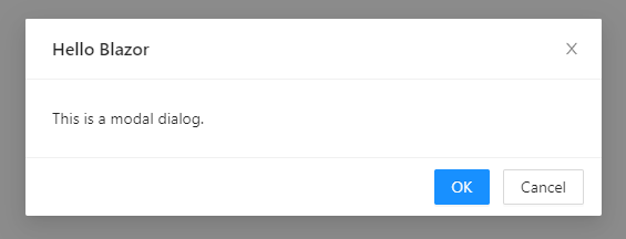
<Modal Title="Hello Blazor" Visible="@_visible" OnOk="@HandleOk" OnCancel="@HandleCancel">
This is a modal dialog.
</Modal>
@code{
private bool _visible;
private void ShowModal()
{
_visible = true;
}
private void HandleOk(MouseEventArgs e)
{
_visible = false;
}
private void HandleCancel(MouseEventArgs e)
{
_visible = false;
}
}
Above code, I created a button to open the modal. When the user clicked on the button, the modal will be displayed to the user. See below figure
Now, let’s break down this code.
<Modal Title="Hello Blazor" Visible="@_visible" OnOk="@HandleOk" OnCancel="@HandleCancel">
    This is a modal dialog.
</Modal>
This is the Modal Component Element. We are changing its visibility when we want to show/hide the modal dialog. The Visible parameter is store the boolean value of the modal’s visible status. OnOk and OnCancel parameters take function to execute when the user clicks the Ok and Cancel buttons in the modal respectively.
Modal Component has more parameters like above. According to official documentation, they are like this.
| Property | Description | Type | Default | |
| AfterClose | Specify a function that will be called when modal is closed completely. | EventCallback | - | |
| BodyStyle | Body style for modal body element. Such as height, padding etc. | string | - | |
| CancelText | Text of the Cancel button | string | RenderFragment | Cancel |
| Centered | Centered Modal | bool | FALSE | |
| Closable | Whether a close (x) button is visible on top right of the modal dialog or not | bool | TRUE | |
| CloseIcon | custom close icon | RenderFragment | - | |
| ConfirmLoading | Whether to apply loading visual effect for OK button or not | bool | FALSE | |
| DestroyOnClose | Whether to unmount child components on onClose | bool | FALSE | |
| Footer | Footer content, set as footer={null} when you don't need default buttons | string | RenderFragment | DialogOptionsBase.DefaultFooter |
| ForceRender | Force render Modal | bool | FALSE | |
| GetContainer | Return the mount node for Modal | ElementReference? | document.body | |
| Keyboard | Whether support press esc to close | bool | TRUE | |
| Mask | Whether show mask or not. | bool | TRUE | |
| MaskClosable | Whether to close the modal dialog when the mask (area outside the modal) is clicked | bool | TRUE | |
| MaskStyle | Style for modal's mask element. | string | - | |
| OkText | Text of the OK button | string | RenderFragment | OK |
| OkType | Button type of the OK button | string | primary | |
| OkButtonProps | The ok button props | ButtonProps | - | |
| CancelButtonProps | The cancel button props | ButtonProps | - | |
| Style | Style of floating layer, typically used at least for adjusting the position. | string | - | |
| Title | The modal dialog's title, If the TitleTemplate is not null, the TitleTemplate takes precedence | string | null | |
| TitleTemplate | The modal dialog's title | RenderFragment | null | |
| Visible | Whether the modal dialog is visible or not | bool | - | |
| Width | Width of the modal dialog | string | double | 520 |
| WrapClassName | The class name of the container of the modal dialog | string | - | |
| ZIndex | The z-index of the Modal | int | 1000 | |
| OnCancel | Specify a function that will be called when a user clicks mask, close button on top right or Cancel button | EventCallback | - | |
| OnOk | Specify a function that will be called when a user clicks the OK button | EventCallback | - | |
| Draggable | Is it allowed to drag Modal through its Header(if true, at least one of Title and TitleTemplate must have a value) | bool | FALSE | |
| DragInViewport | If Draggable is true, and is it only allowed drag Modal in the viewport | bool | TRUE | |
| MaxBodyHeight | Modal content max height | string? | null | |
| Maximizable | Whether to display the maximize button | bool | FALSE | |
| MaximizeBtnIcon | The icon of the maximize button when the modal is in normal state | RenderFragment | fullscreen | |
| RestoreBtnIcon | The icon of the maximize button when the modal is in maximized state | RenderFragment | fullscreen-exit | |
| DefaultMaximized | Modal is maximized at initialization | bool | FALSE |
In the above example code, I give a string as a title. But if you want to add a button or something like that to the title we can use <TitleTemplate> tag like this.
<Modal Visible="@_visible" OnOk="@HandleOk" OnCancel="@HandleCancel" Closable="false">
    <TitleTemplate>
        <div style="display:flex; justify-content: space-between; align-items: center">
            <p>
                This is title
            </p>
            <Button Type="@ButtonType.Primary">Click Me</Button>
        </div>
    </TitleTemplate>
    <ChildContent>
        This is a modal dialog.
    </ChildContent>
</Modal>
You can see in the above code, I have used another tag called <ChildContent>. If we used <TitleTemplate> in our modal, we have to use this <ChildContent> tag definitely. If we didn’t use that our modal’s content will not be displayed.
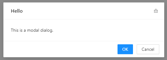
You can also change the close icon of the modal. To do that we can use the <CloseIcon> tag. Like before, if we use this tag, again we have to use the <ChildContent> tag. See below code and output.
<Modal Visible="@_visible" OnOk="@HandleOk" Title="Hello" OnCancel="@HandleCancel" >
    <ChildContent>
        This is a modal dialog.
    </ChildContent>
    <CloseIcon>
        <Icon Type="clear" Theme="outline"/>
    </CloseIcon>
</Modal>
When you create a maximizable modal, you can there is additional icon button to maximize and restore the modal. We can change these icons too. There are two tags for that. See this code
<Modal Visible="@_visible" OnOk="@HandleOk" Maximizable="true" DefaultMaximized="false">
    <TitleTemplate>
        Hello
    </TitleTemplate>
    <ChildContent>
        This is a modal dialog.
    </ChildContent>
    <MaximizeBtnIcon>
        <Icon Type="deployment-unit" Theme="outline"/>
    </MaximizeBtnIcon>
    <RestoreBtnIcon>
        <Icon Type="fire" Theme="outline"/>
    </RestoreBtnIcon>
</Modal>
<MaximizeBtnIcon> tag is used to change maximize button and <RestoreBtnIcon> is used to change the restore modal button
<TitleTemplate>
<CloseIcon>
<RestoreBtnIcon>
<MaximizeBtnIcon>
If you use one of the above tags in our modal, you should use <ChildContent> tag to wrap your modal body content
Now you know how to create Ant Blazor modal dialog using Modal Component. You can play with different options of a modal. See you in the next article. Happy Coding. If you found this article useful, don't forget to give a like.

You can connect with me on https://hirushafernando.com/